Barclays / Absa Internet Banking

Starting Over to Put Customers First

Barclays banks in 9 African countries were changing to Absa Bank and its dated internet banking platform was redesigned to address nearly two decades worth of accumulated issues.

project image
Business Challenge
The legacy Barclays desktop banking platform used what was by now very obsolete technology. It had severe scalability and usability issues and we had to solve for both in time for Absa's launch into new African markets.
project image

Quick FAQ

Why not reskin the old platform?

It was very outdated, with a hardcoded frontend and embedded functions. It lacked a single codebase and there was very little documentation.

Why didn't we use Absa's own internet banking platform?

Absa Africa was going to run as a seperate entity with its own set of unique requirements. Absa Bank used fundamentally different core banking technology from Barclays and merging systems wasn't feasible.

Process: Design Thinking is about more than Design

A human-centered approach helps us to identify and solve product problems. By solving with the user at the center, we also build the best solution for the business.

I applied the Double Diamond framework each of the many subsets of product, design and business challenges we faced throught the duration of the project.

project image
project image
01 Discover
The discovery phase was a massive undertaking, involving stakeholders from 10 countries. Our goal was to understand the problems to be solved, the target users, and to define project's goals. Given the scale of this project, this phase was ongoing throughout its duration.
project image

Quantitative Data (The What)

Data was sporadic in some cases and difficult to come by but I sought out as much hard user data as I could find. This data revealed many surprising facts about platform usage overall as well as country-specific detail. Quantitative data analysis often raises more questions than it answers and this is good, because now I knew what questions to ask.

77%
Mainland users were SME business customers
68%
Customers used the desktop internet banking platform exclusively on a mobile device
project image
The majority of users lived in urban parts of the more developed markets
project image
Users typically fell into higher income categories
project image

User Research (The Why)

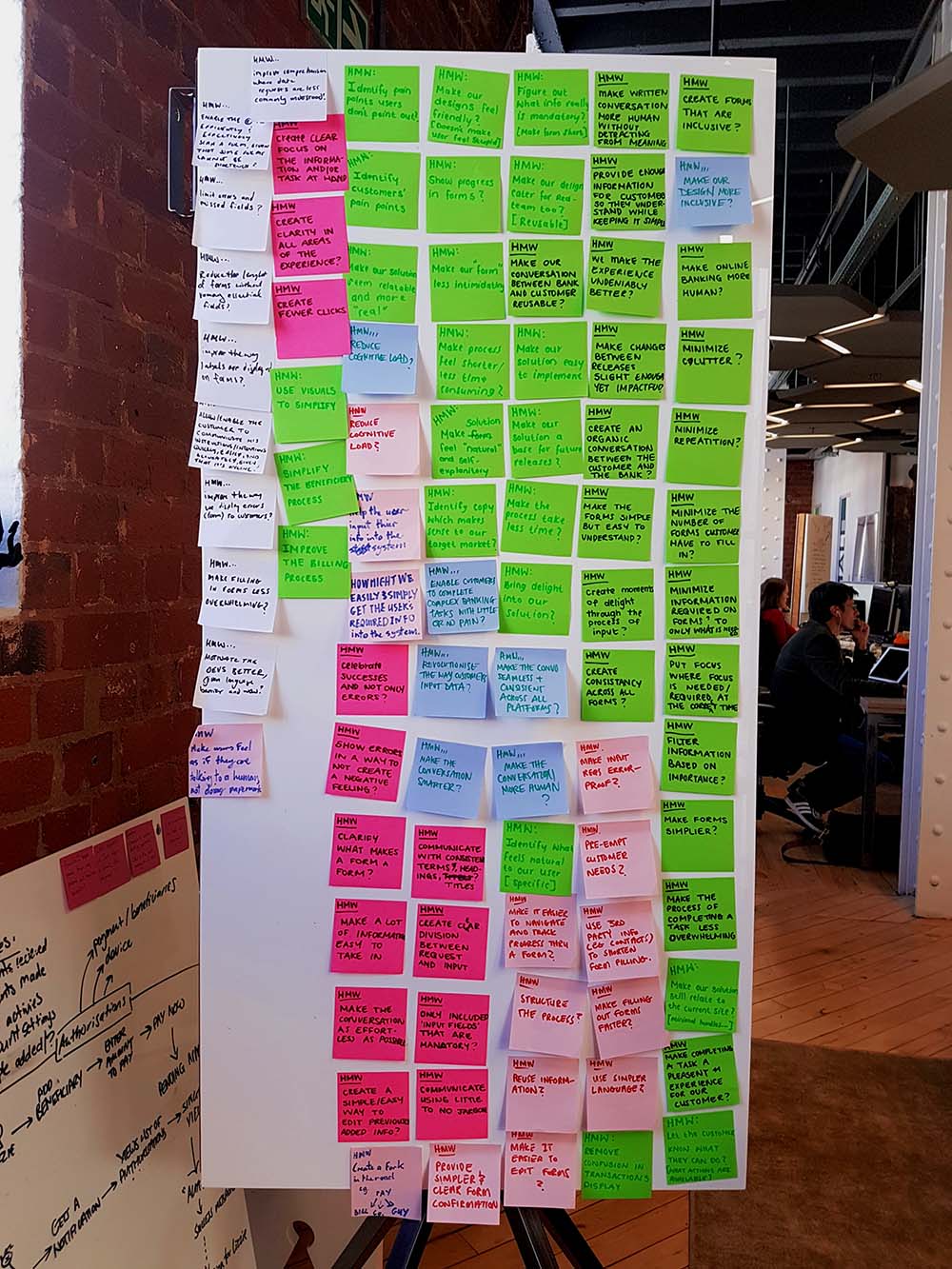
I arranged with local bank managers to give me access to real customers in their homes and at their places of work. I could observe them using the digital tools in a real-world environment as they completed their banking tasks online. This was incredibly valuable because they would raise issues that had never come up elsewhere. I could observe their interaction patterns, identify their pain points and their emotional responses.

project image
''Why do I need to go in to a branch to conduct [transaction type]?''
project image
''I didn't know [hidden feature] was possible online.''
project image
''I'm locked out of the website because I forgot my security question. I'm not sure how to get back in.''
project image
''I use this feature every week, but I forget how to do it, so I have written the steps down in a notebook.''
~ Restaurant Owner
project image
''This website is so frustrating, I opened an account with [competing bank] but don't tell anyone...''
~ Barclays Bank Manager
project image
02 Define
The define phase takes the insights from discovery and converges them into a clear problem statement, outlining the core issue, its impact on users, and why it needs solving. This phase also sets success criteria, ensuring that solutions are targeted to effectively address the problem.
project image
Inconsitent navigation was confusing and frustrating
project image
Sign-in was cumbersome and highly error-prone
project image
Powerful features were hidden
project image
People struggled with dense forms and counterintuitive flows
project image

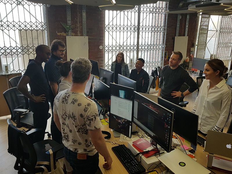
How Might We

HMW statements are questions that turn problems into opportunities for finding solutions. They focus on potential solutions while keeping the user's needs at the center.
project image
HMW create a universally consistent approach to forms, given that there are so many variations?
project image
HMW simplify the navigation and information architecture, given the sheer volume of options?
project image
HMW we make the experience mobile friendly, given that so many users have asked for this?
project image
HMW we make the user feel supported when they run into problems, given that their current solution is going to the branch?
project image
Problem Statements
At this point, we could clearly articulate a Problem Statement. The overarching problem statement is a high level view. It's too big to solve directly but it helped us to build stakeholder alignment and focus on a clear strategy for tackling the many underlying challenges to follow.

High Level Problem Statement


Customers face frustration and roadblocks when using our internet banking service due to its inconsistent design and excessive complexity that has accumulated for many years. These underlying structural issues severely hinder our ability to scale the system effectively or integrate new features, demanding a comprehensive overhaul to create a streamlined and future-proof foundation.

Focused Problem Statement


The system lacks consistency on the front and backend, making it more difficult for the banks to integrate new features and for customers to understand where to find features or predict how the site is organized.

Actionable Problem Statements


Example 1: Customers struggle to locate payment types, transfer funds options, accounts history and beneficiary management because of inconsistent navigation.

Example 2: Customers struggle to sign in because they frequently forget the security questions and, once they are locked out, the call center and branches are often unable to help them reset their password.

Example 3: The banks struggle to incorporate new payment methods and other third party integrations via API because of the platform's age and fragmented tech stack.
project image
03 Develop
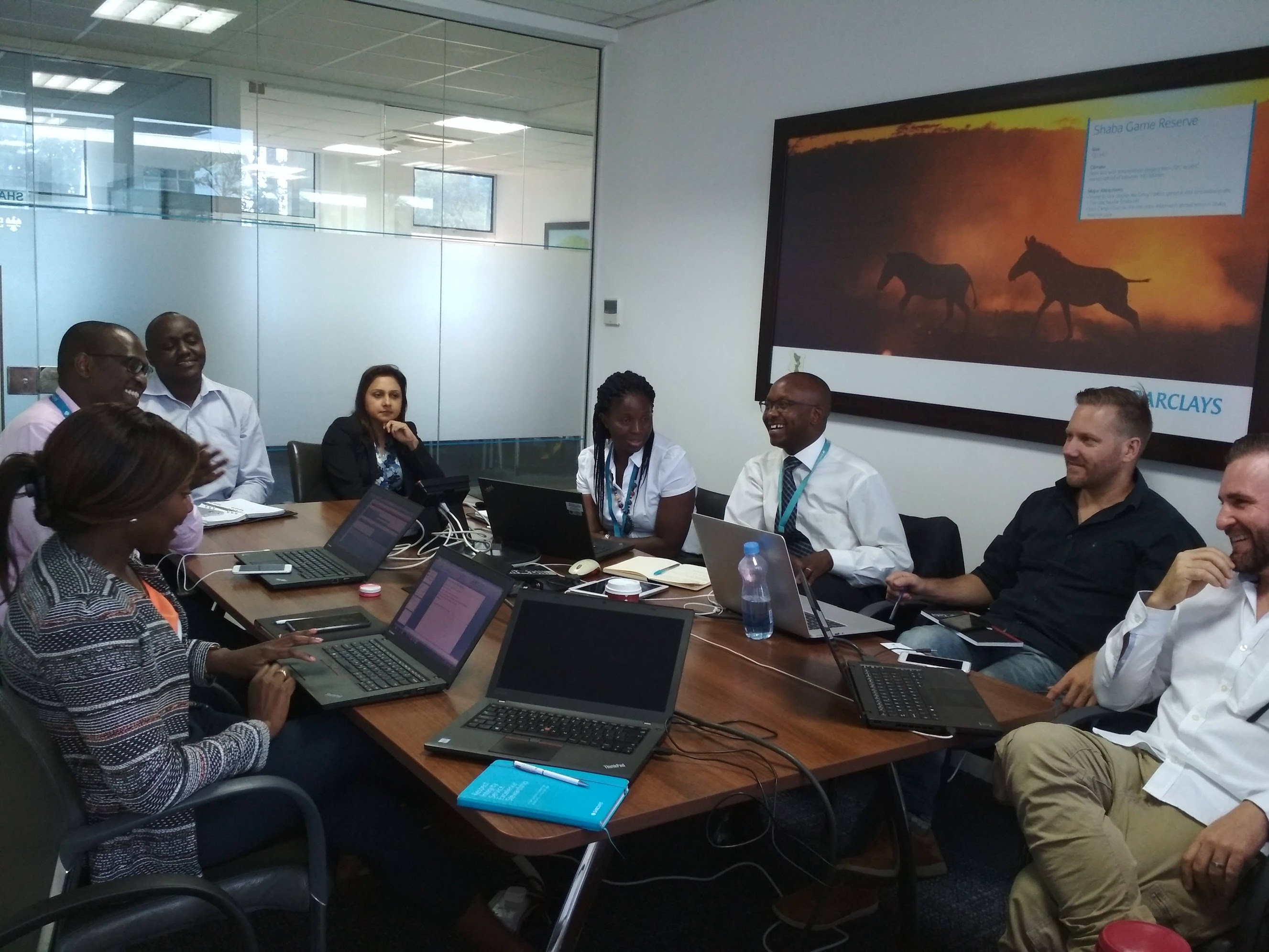
In the develop stage the focus shifts from defining the problem to brainstorming and refining potential solutions. This stage involves generating a wide range of ideas through techniques like sketching, prototyping, and collaborative workshops. This process was repeated over and over, with prototyped solutions thoroughly validated through user testing in our various markets.
project image

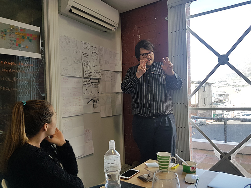
I put together a dedicated cross-functional squad
project image

Problems were tackled one by one in short sprints
project image

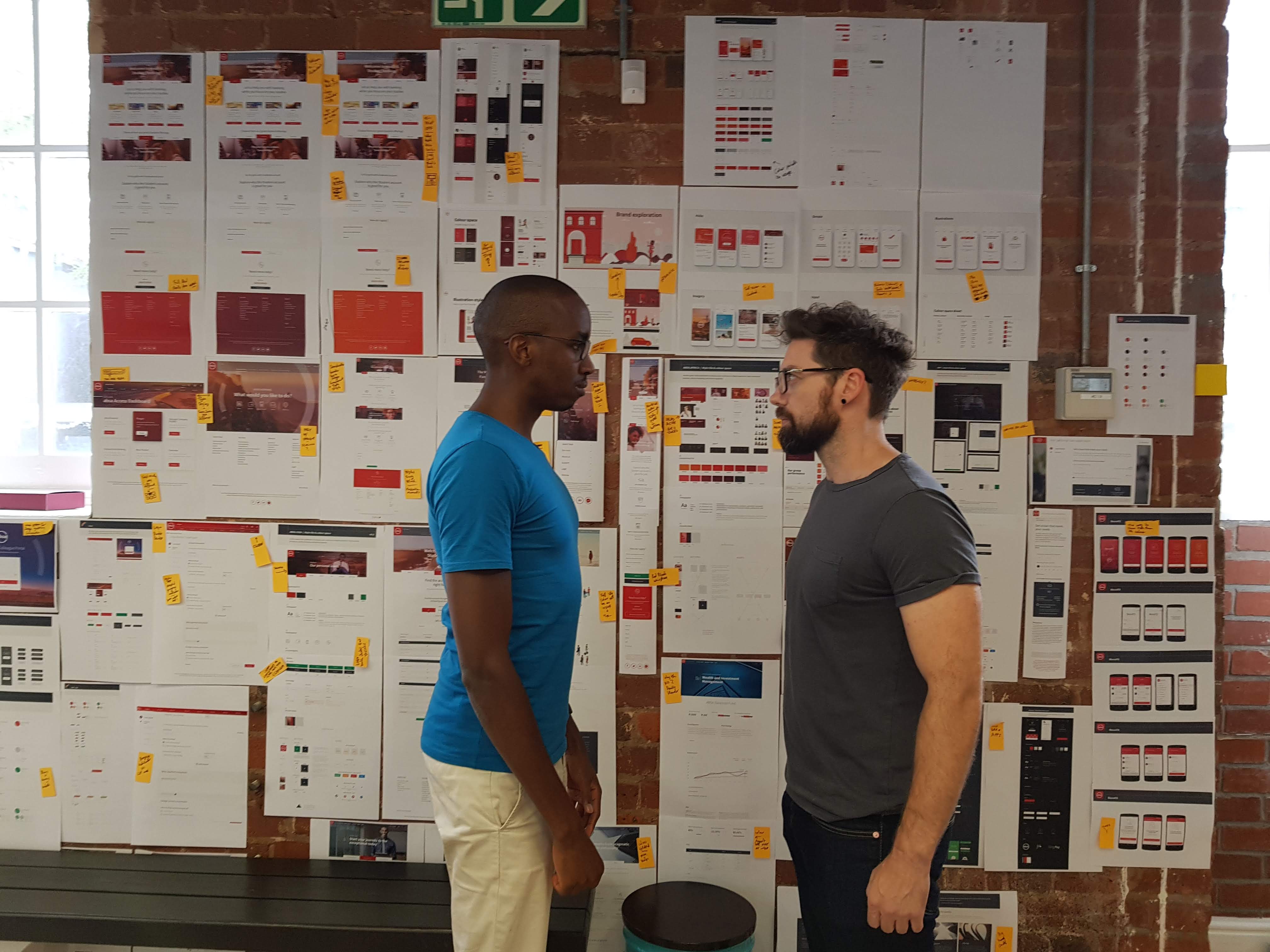
Solutions were vigorously debated

project image

Prototypes were regularly presented to stakeholders across the continent
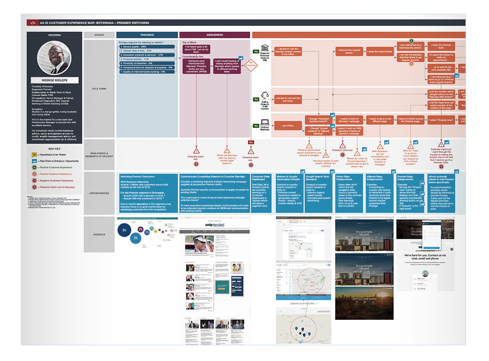
Customer Journey Mapping

I worked closely with CX teams to establish a holistic view of customers that reached across all touch points
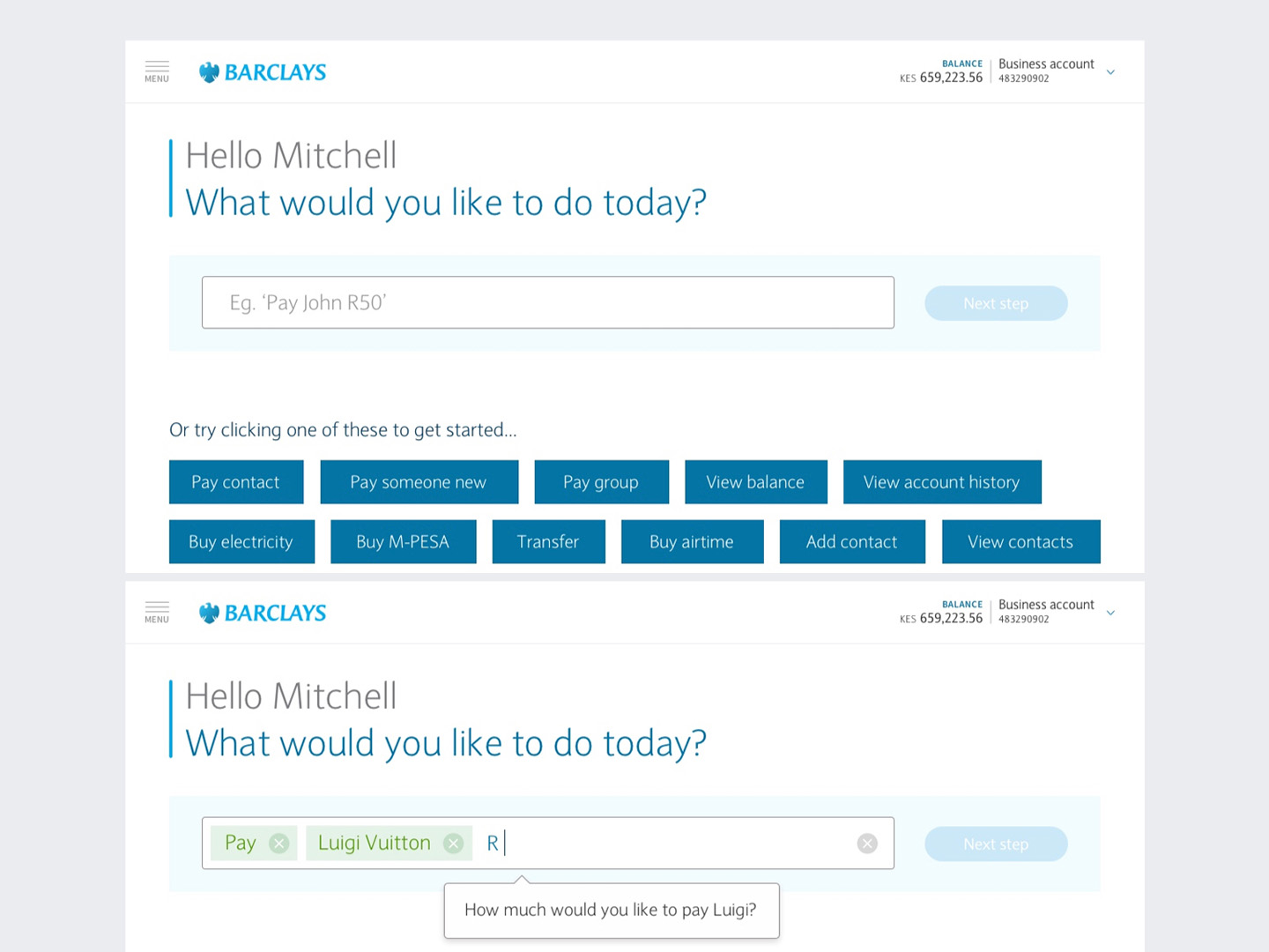
Building a workflow - experiments

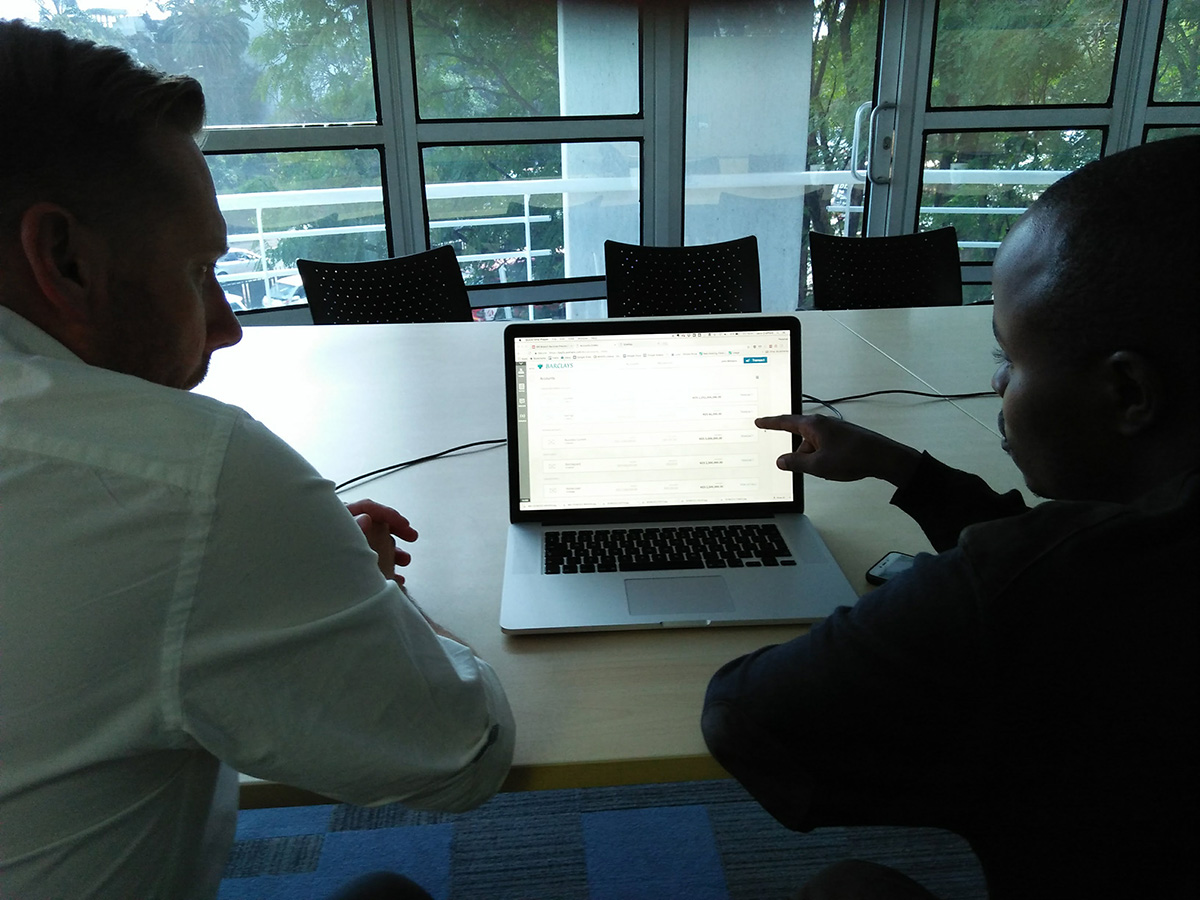
We created many experimental prototypes to test our assumptions and especially our wildest ideas with real users.
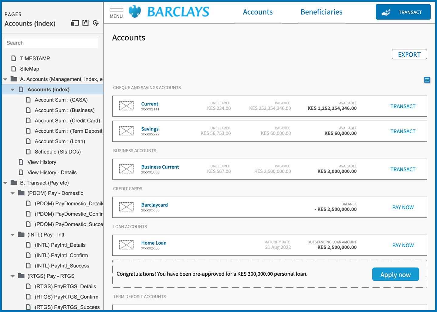
Axure prototype

Every aspect was built in Axure as an interactive prototype. This allowed for rapid updates and testing.
project image
04 Deliver
In the deliver stage we finalised and built the solution. This involved UI Design, UX writing, development, more user testing, some last-minute refinements and documentation.
Initiate Workflow

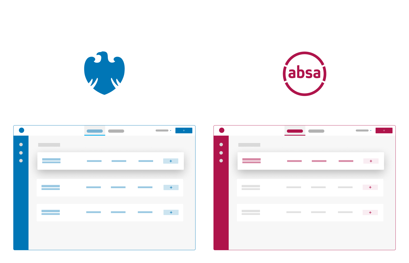
We had no idea what the new Absa brand was going to look like. The UI was designed to be as simple as possible (almost white-label) so that we could better accommodate the new Absa brand which was still under development.
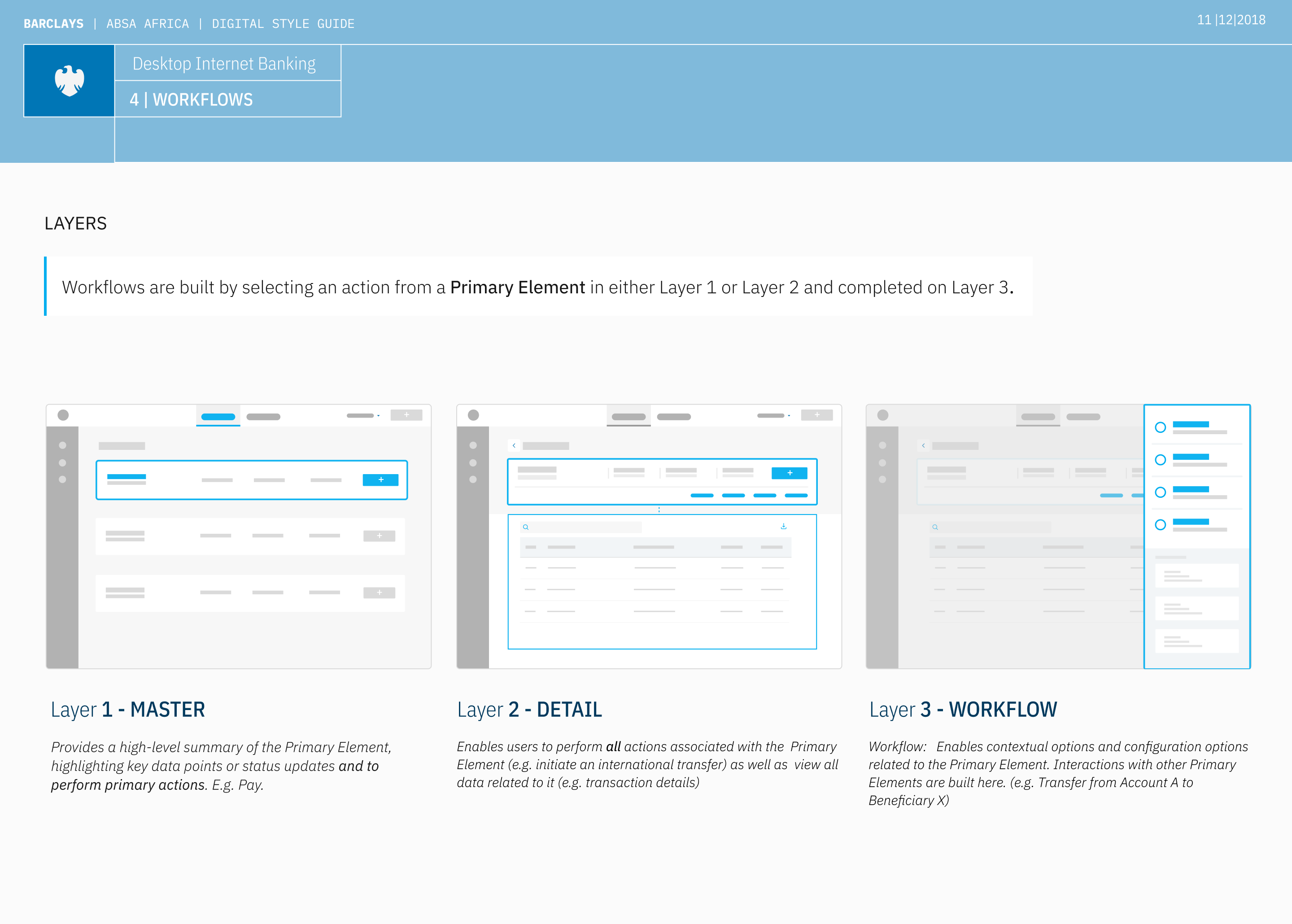
Navigational Layers

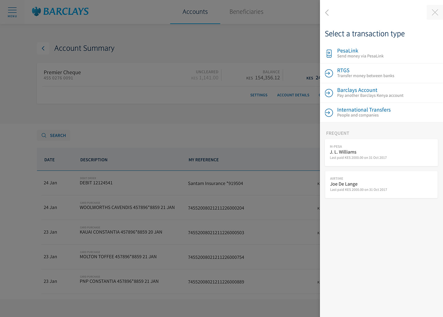
The simplified navigation structure consists of three layers and is intended to facilitate almost any user task (workflows) in a predictable pattern. Testing confirmed that users struggled to perform tasks when they deviated from an established pattern. I developed an approach that allowed users to perform most tasks consistently and without navigating away from their starting point. A dynamic modal we called the Action Panel meets users where they are and enables them to complete tasks from within their contextual starting point.
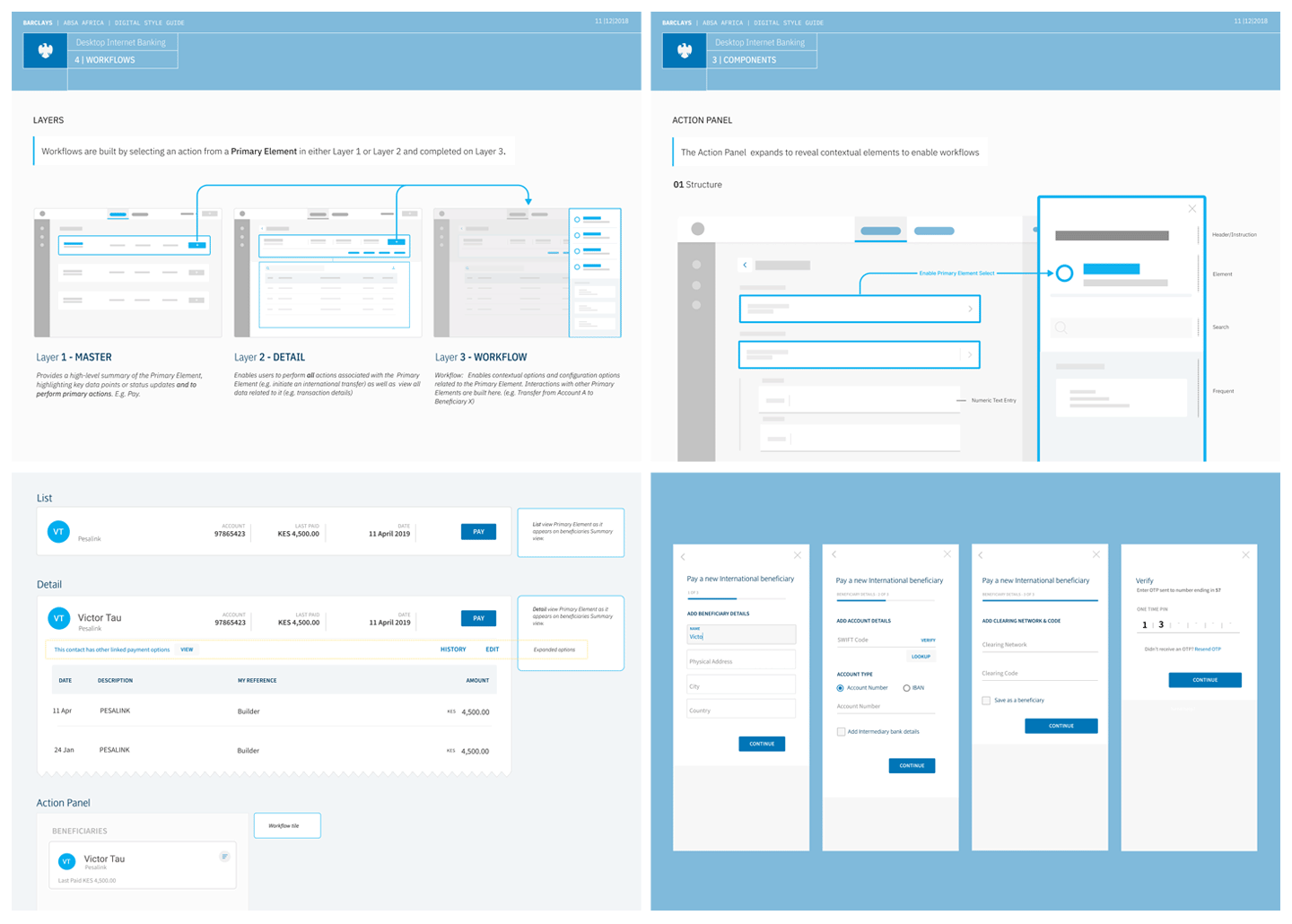
Workflows

Detailed styleguides xplained the practical implementation of every aspect of the design and the rationale behind its guidelines.
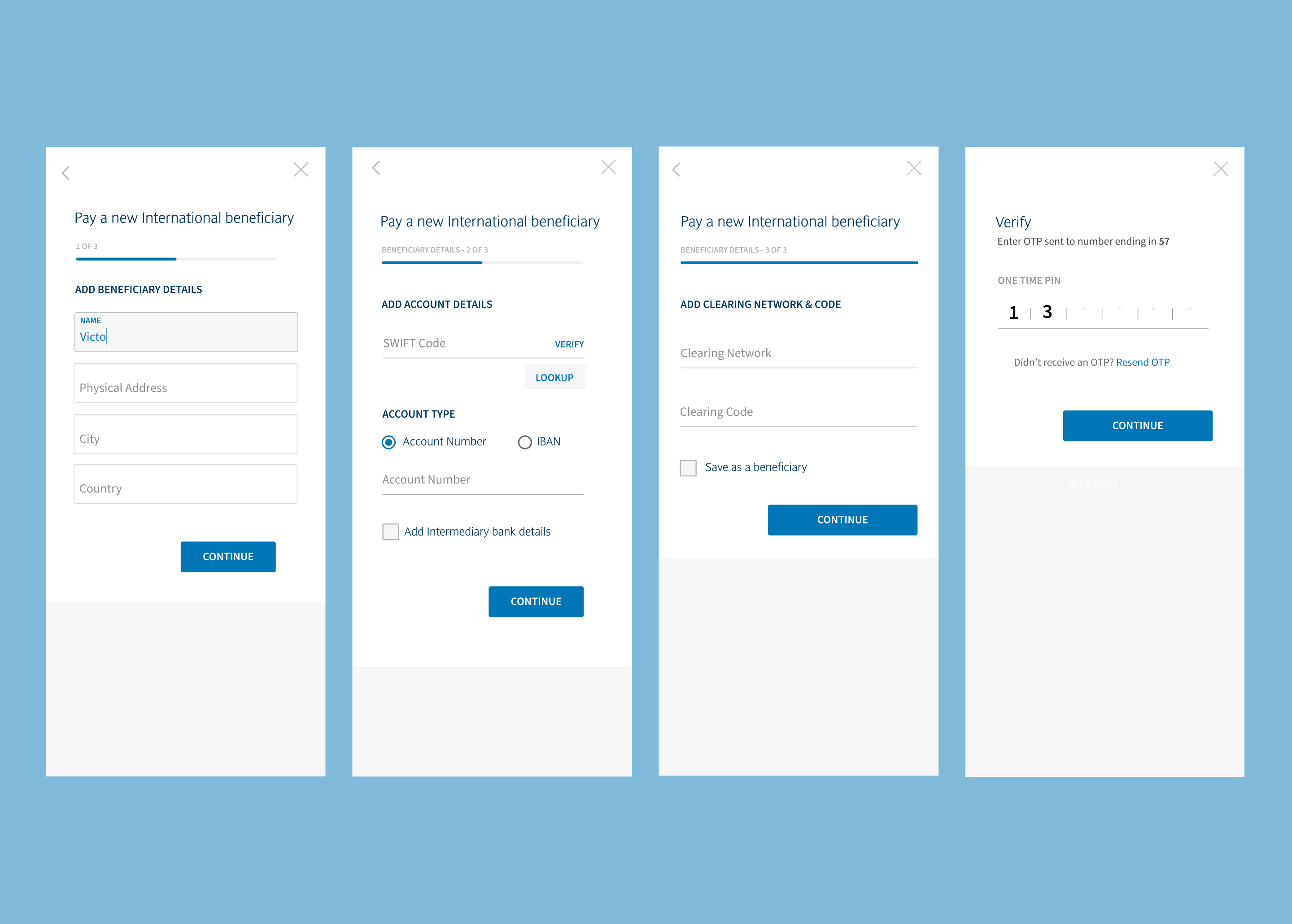
The Action Panel Element

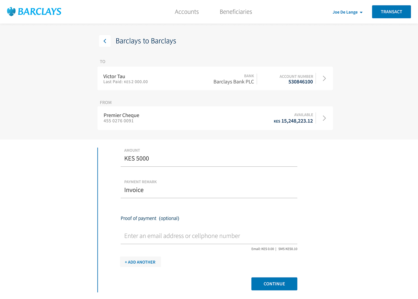
A payment workflow as it appears in the Action Panel modal.
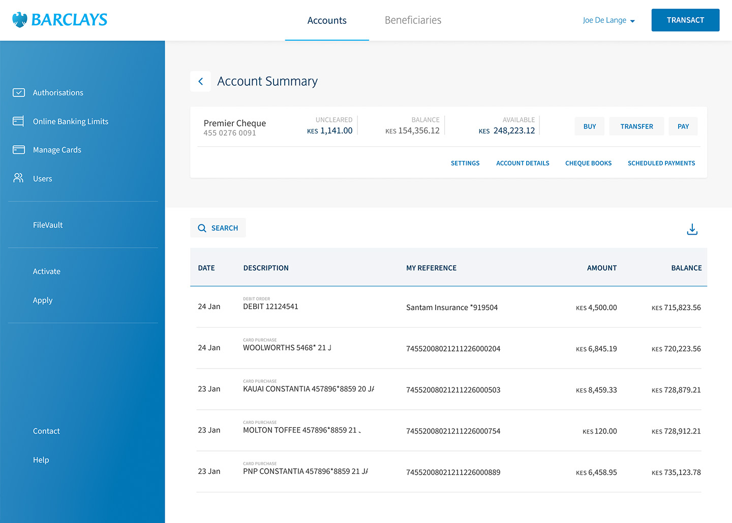
Account Summary

Account Summary View

Action Panel Modal

Initiating a transaction from an within an account view.
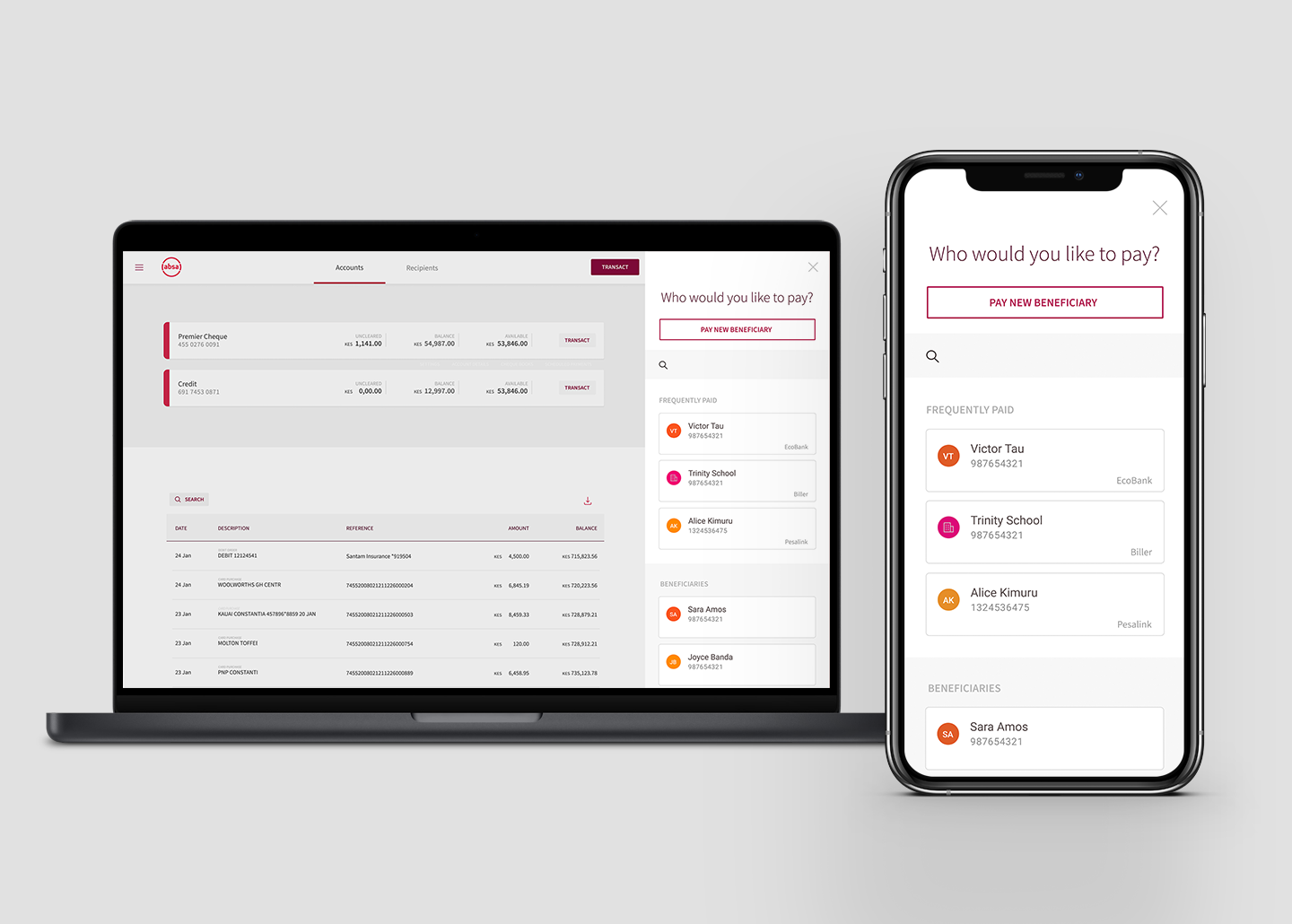
Absa branded internet banking showing mobile responsive Action modal

Absa branded desktop internet banking showing the mobile responsive view.
An interesting discovery was that many customers preferred to use web-based tools over apps. This had to do with a variety of factors including available space on their phones. In addition, most internet banking users wanted to access the service from their mobile devices. Desktop computers are not as widespread in most African countries and users needed access to functionality that was not available in the mobile app.
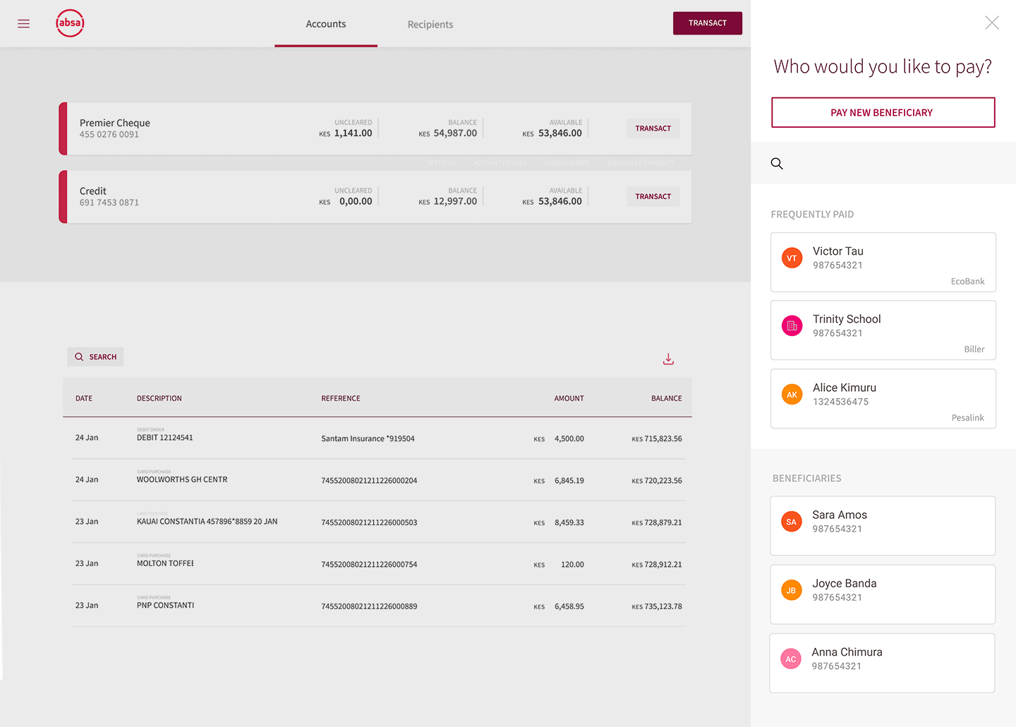
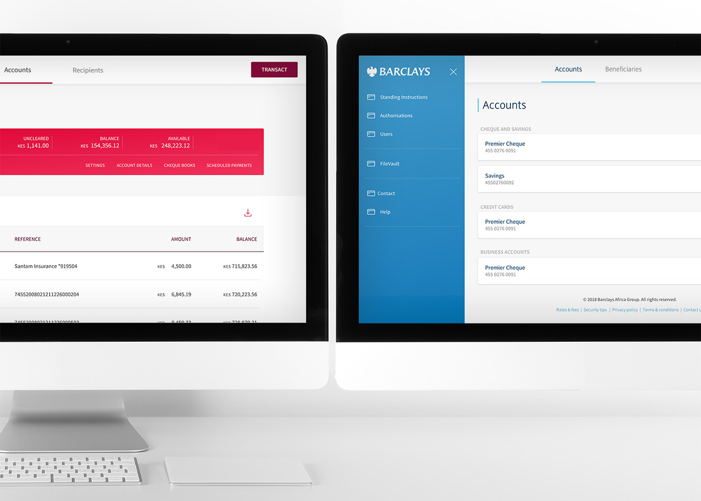
The new Absa Africa / Barclays desktop internet banking website
project image
Success.
We invested heavily in meticulous planning, fostered broad collaboration across teams, and conducted extensive research and validation. This commitment to a user-centered approach paid off in spades, ensuring the project's ultimate success.
project image

Understanding the unique requirements of business users, our mobile-friendly approach empowered SMEs with mobile-only access to the advanced desktop banking features that are excluded from the mobile banking app.

project image11%
Increase in active users on the platform 12 months after launch

It set the standard for other digital channels, with workflows, the simplified navigational layers and its Action Modal being adopted by a number of Absa's other digital platforms.

20%
Total decrease in call centre support queries related to the online banking website