22seven

Balancing Friction and Value
For an Effective Onboarding Strategy

22seven simplifies users' finances by consolidating their accounts, tracking their spending, and automatically creating a personalized budget. This empowers users to see all their money in one place, effortlessly manage their finances, and gain sophisticated insights into their spending habits.

project image
Business Challenge
While the app attracts initial downloads and high sign-ups, we need to identify and address the factors causing significant user churn within 90 days to improve long-term retention and engagement.

Process

My approach prioritizes human-centered methodologies. This helps us to correctly identify the problem we are solving for the user and build the right solution.

The design thinking double diamond process uses two interlocking diamonds to represent a human-centered approach to solving problems.

project image
project image
01 Discover
During the the discovery phase we diverge to understand the problem to be solved, the target users, and the project's goals. The discovery phase lays the groundwork for the entire project. It reduces risk by identifying problems early, gets everyone on the same page, and makes sure the solutions developed address real user needs.
project image

Quantitative Data (The What)

I analysed hard user data to identify usage patterns. This data reveals the facts of the problem: Overall engagement was very low and, while most users did not link a bank account, users who did so were highly engaged.

20%
new users were still engaged after 90 days
90%
engaged users had linked a bank account when they signed up
project image
project image

User Research (The Why)

I interviewed stakeholders within the business, highly engaged users, and users who had signed up but abandoned the app. This qualitative data compliments the data we already had by shining a light on the reasons behind the usage patterns observed by surfacing common themes.

project image
''Signing up was so simple, but what now?''
project image
''I’ll link my bank account later''
project image
''Is this really secure?''
project image
''I loved the app when I got it but I forget to use it''
project image
02 Define
The define phase takes the insights from discovery and converges them into a clear problem statement, outlining the core issue, its impact on users, and why it needs solving. This phase also sets success criteria, ensuring that solutions are targeted to effectively address the problem.
project image
Clear link between linked bank accounts and engagement
project image
Linking a bank account unlocks all the value but it requires more trust
project image
Users are only amazed by features when seen through the lens of their personal data
project image
Users who sign up without linking a bank account upfront, rarely do so later
project image
project image

How Might We

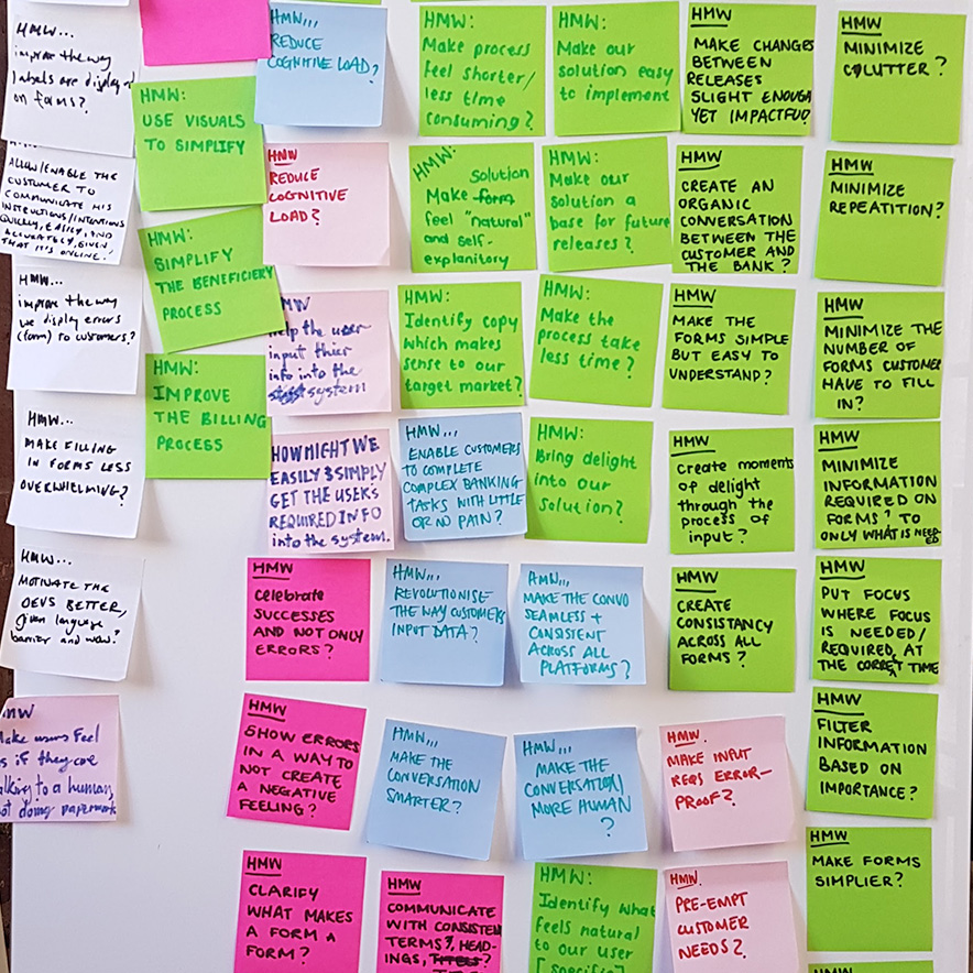
HMW statements are questions that turn problems into opportunities for finding solutions. They focus on potential solutions while keeping the user's needs at the center.

project image
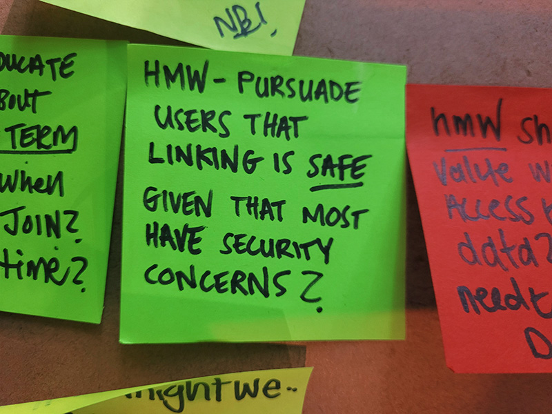
HMW encourage users to link a bank account, given their concerns about security?
project image
HMW show users the personal benefits of linking accounts, given that we don’t have access to their data?
project image
HMW we double the number of users who are engaged after 90 days, given that most users churn?
project image
HMW get users to say ‘Wow!’ the first time they use the app, given that many find the experience underwhelming?
project image
Problem Statement
At this point, we are ready to formulate a problem statement. It’s a laser focus on a user issue. It clarifies what's broken, who's impacted, and why it matters. This keeps everyone aligned and drives solutions that fix the real problem.
Despite strong initial sign-ups, we experience significant user churn within 90 days because 22seven’s best features require linked bank accounts to demonstrate their personalised value, yet users are hesitant to link accounts without first experiencing that value, creating a barrier to long-term engagement.
project image
03 Develop
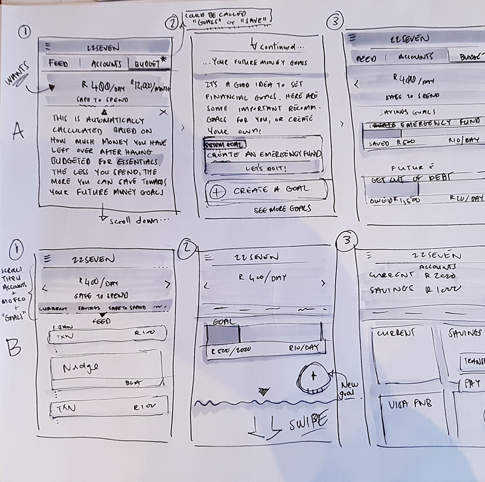
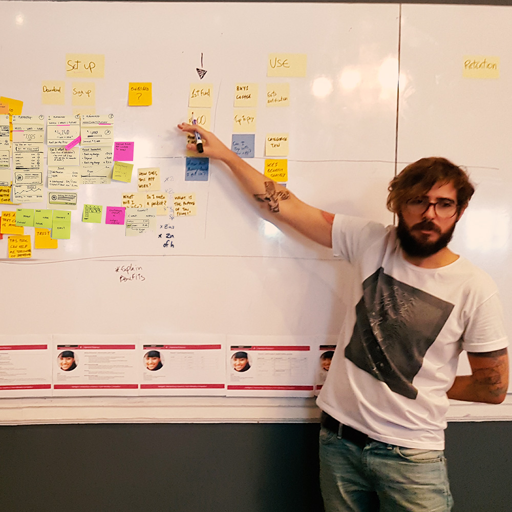
In the develop stage the focus shifts from defining the problem to brainstorming and refining potential solutions. This stage involves generating a wide range of ideas through techniques like sketching, prototyping, and collaborative workshops.
project image

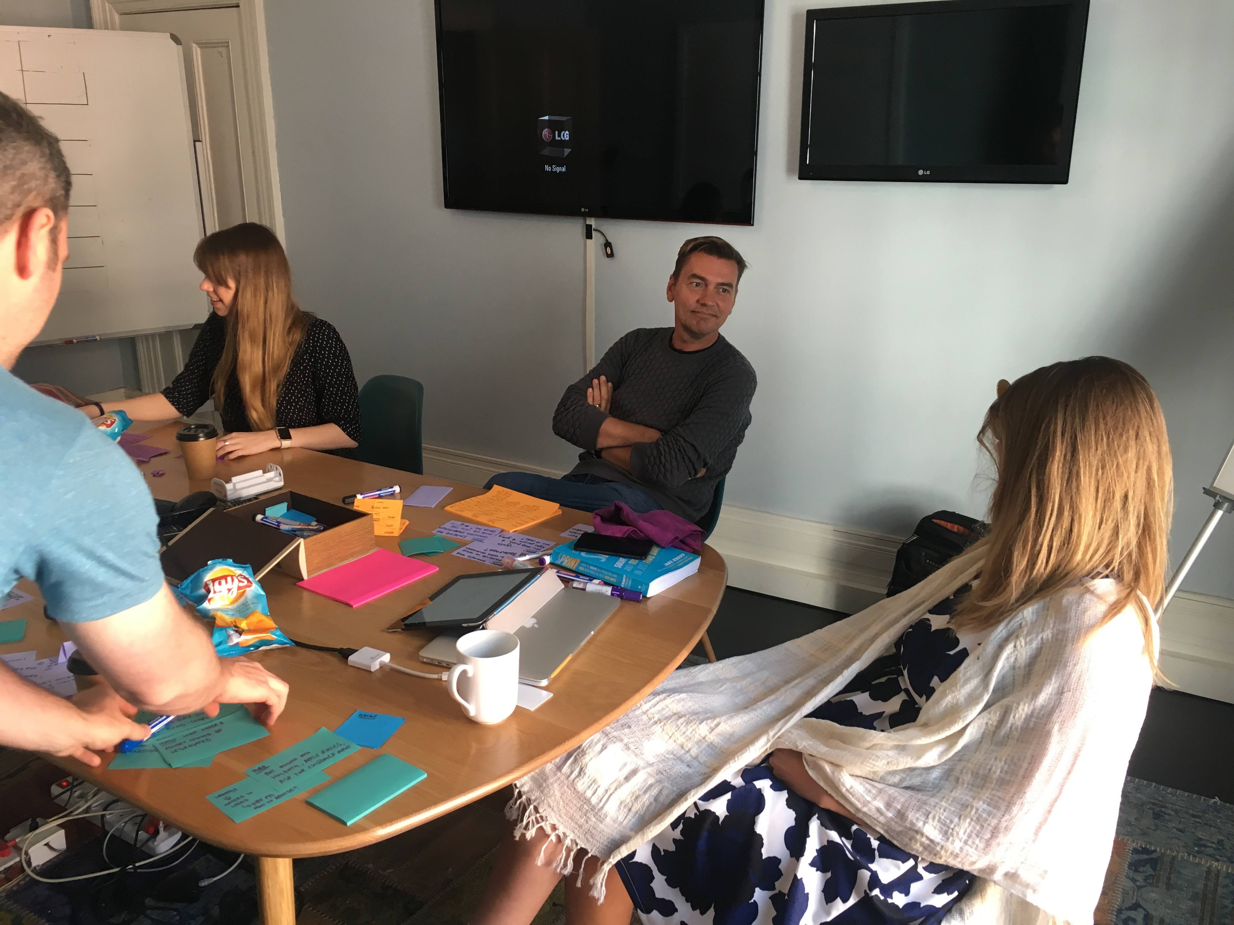
We generated hundreds of ideas and sketches and over a period of two days.

project image

Everyone presented their ideas to the team in a cross-functional forum and debated the proposed solutions.

project image

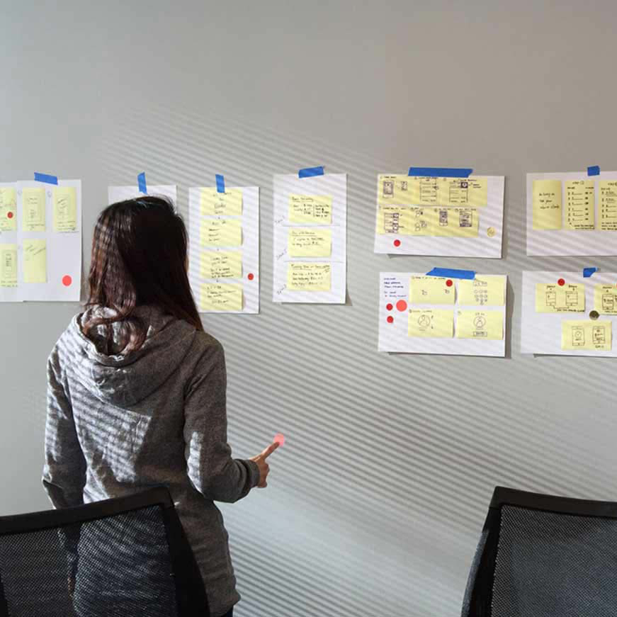
The cross-functional team voted on the best ideas by placing dots on their favourite solutions.

project image

A Big Decision Was Made

The most promising ideas converged around a structured onboarding experience that included the added friction of requiring users to link an account upfront.

This trade-off sacrificed initial ease for greater long-term engagement and user value. By asking more upfront, we could ensure users are better positioned to experience the full benefits that 22seven offers.

To be successful, the solution had to meet the following criteria:

project image
Draw new users in and get them excited about the tool's possibilities
project image
Overcome scepticism to instill trust in our security
project image
Immediately reward users for linking their account by generating amazing insights from their own data as part of the onboarding journey
project image
project image
04 Deliver
In the deliver stage we finalised and built the solution. This involved UI Design, UX writing, development, more user testing, and some last-minute refinements.

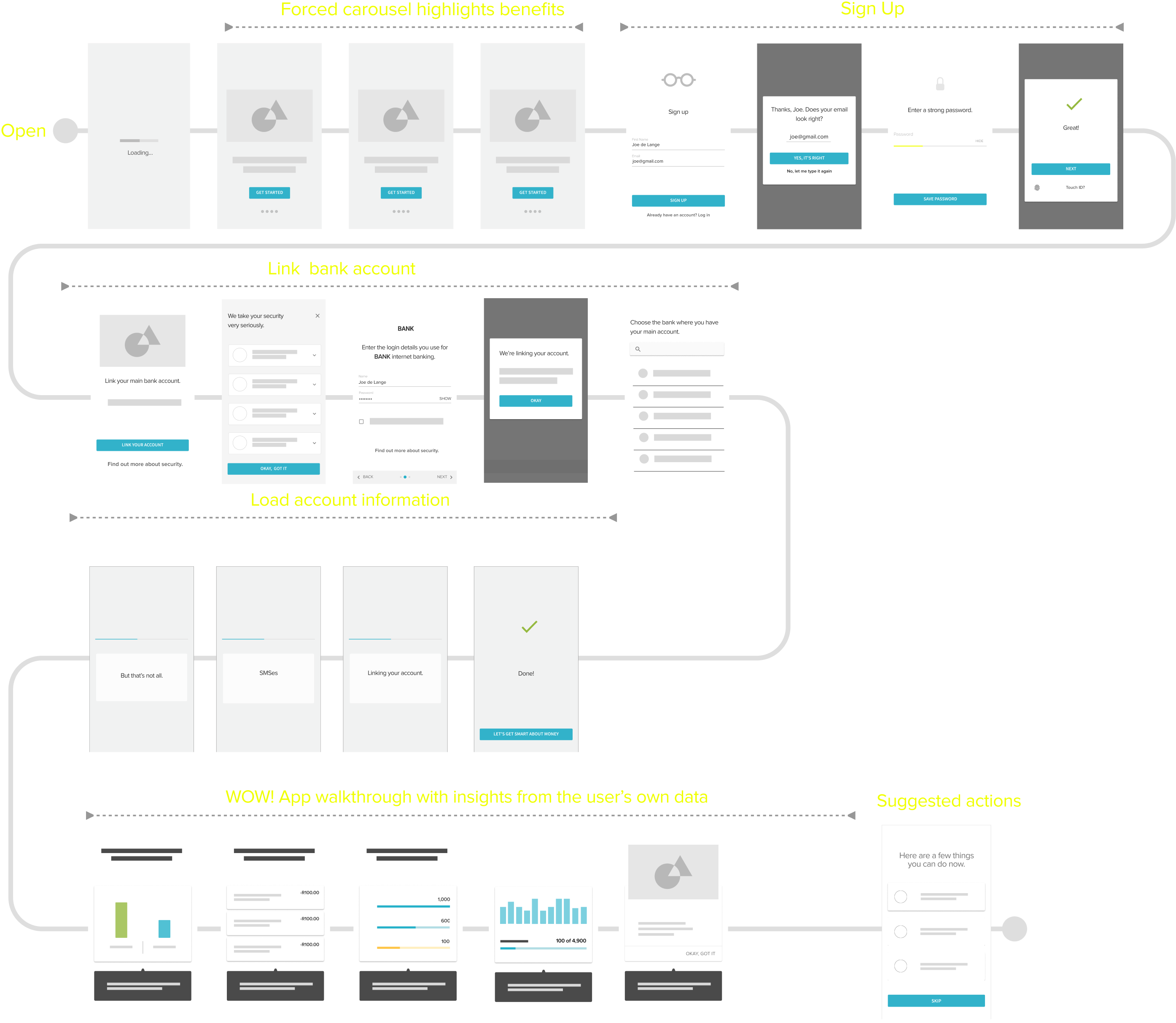
We begin with a carousel highlighting the app's best features and users cannot skip past it.

project image

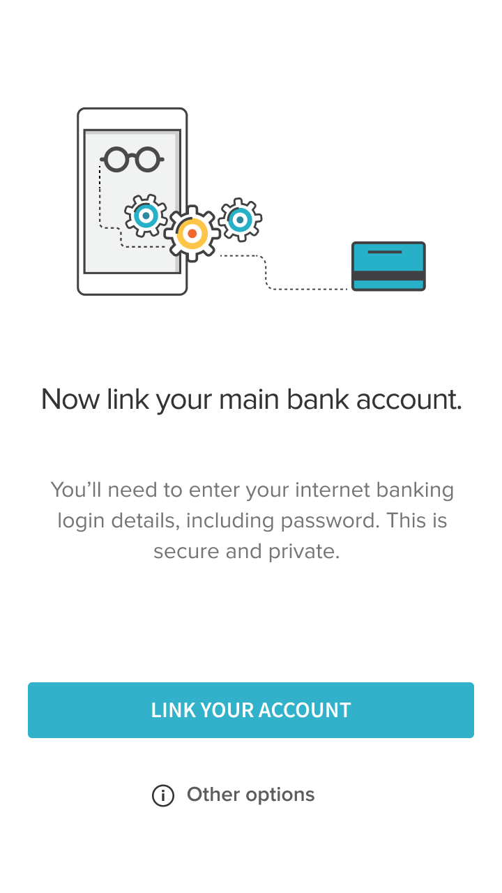
Emphasise security and require a linked transactional account.

project image

Transparency and more information as we link the account.

project image

Immediately present the user with a Wow! moment by generating powerful insights from their data.

project image
project image
Success.
We are able to ship the app with the new onboarding strategy in only 32 days from start to finish.
project image

Requiring more effort and trust during onboarding, and then immediately showcasing the deep personal insights gained from their own data, led to increased user buy-in and a more engaged audience.

project image76%
New users were still engaged after 90 days
project image51%
Total increase in engagement after 90 days
project image40%
Increase in new users linking a bank account